Hnutí Generace
Two collaborations, two visual directions: a website, brand manual and print materials for Hnutí Generace.

- Industry
- Politics
- Scope
- Website, identity and print materials
- Timeline
- 2024 to 2025
- Stack
- WordPress, Breakdance, Plesk
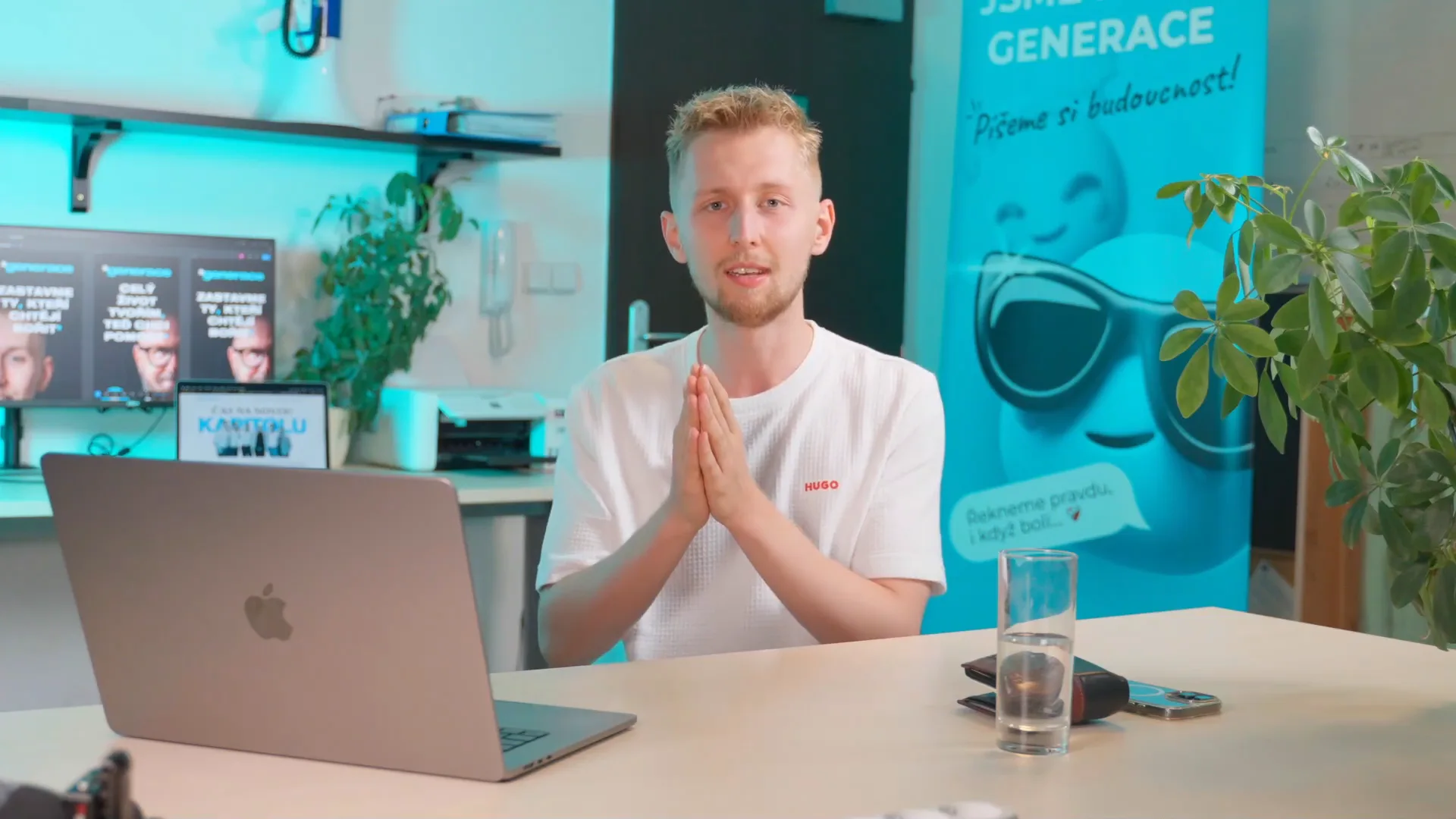
Daniel Krutý on the collaboration
The brand manual, page by page
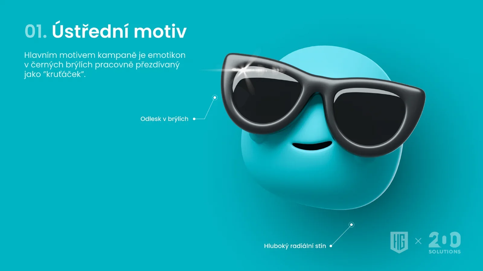
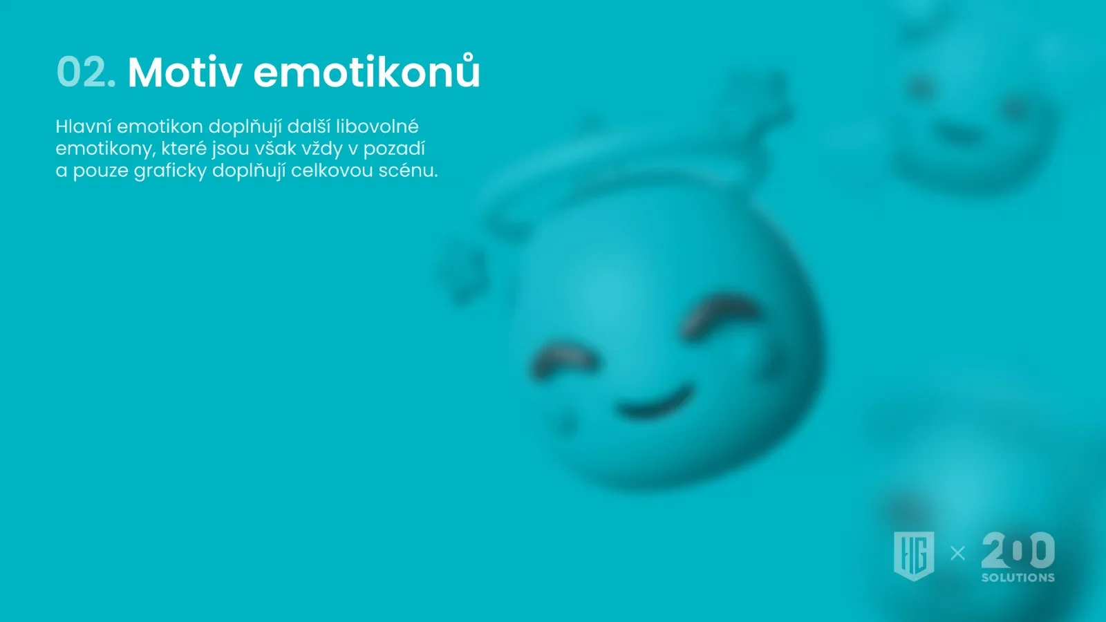
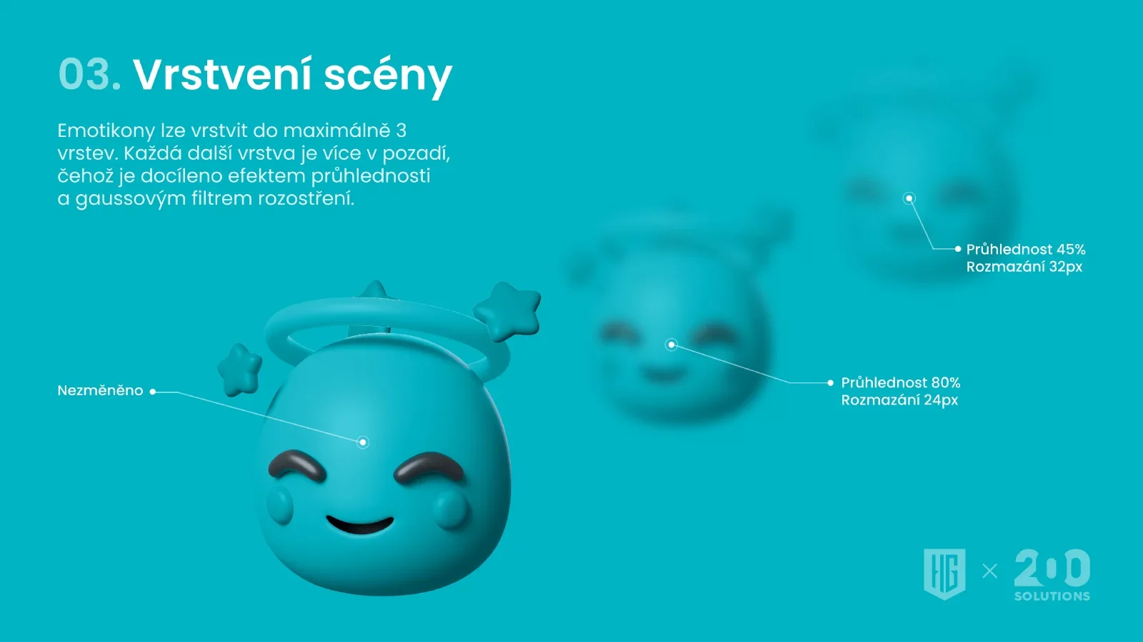
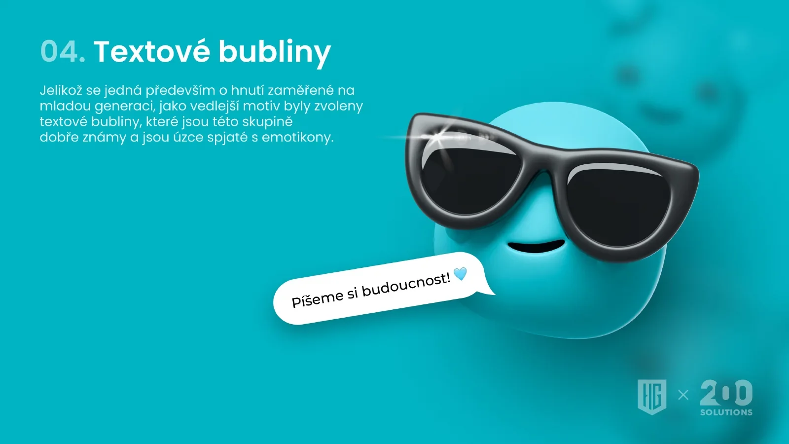
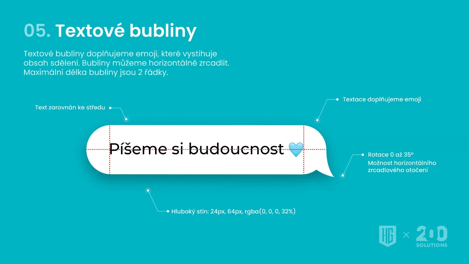
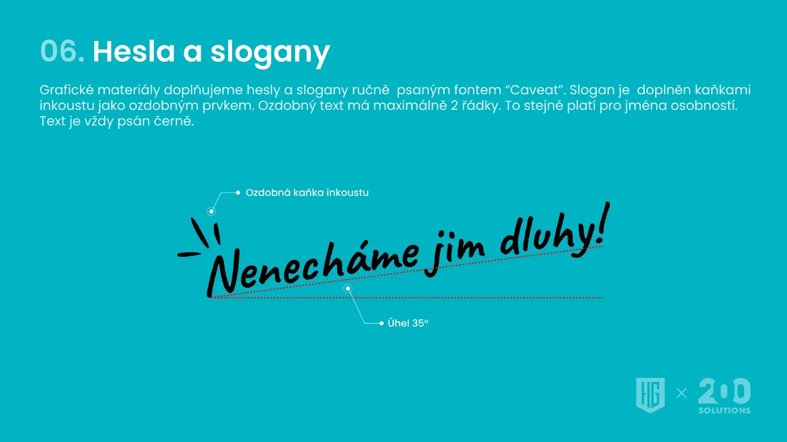
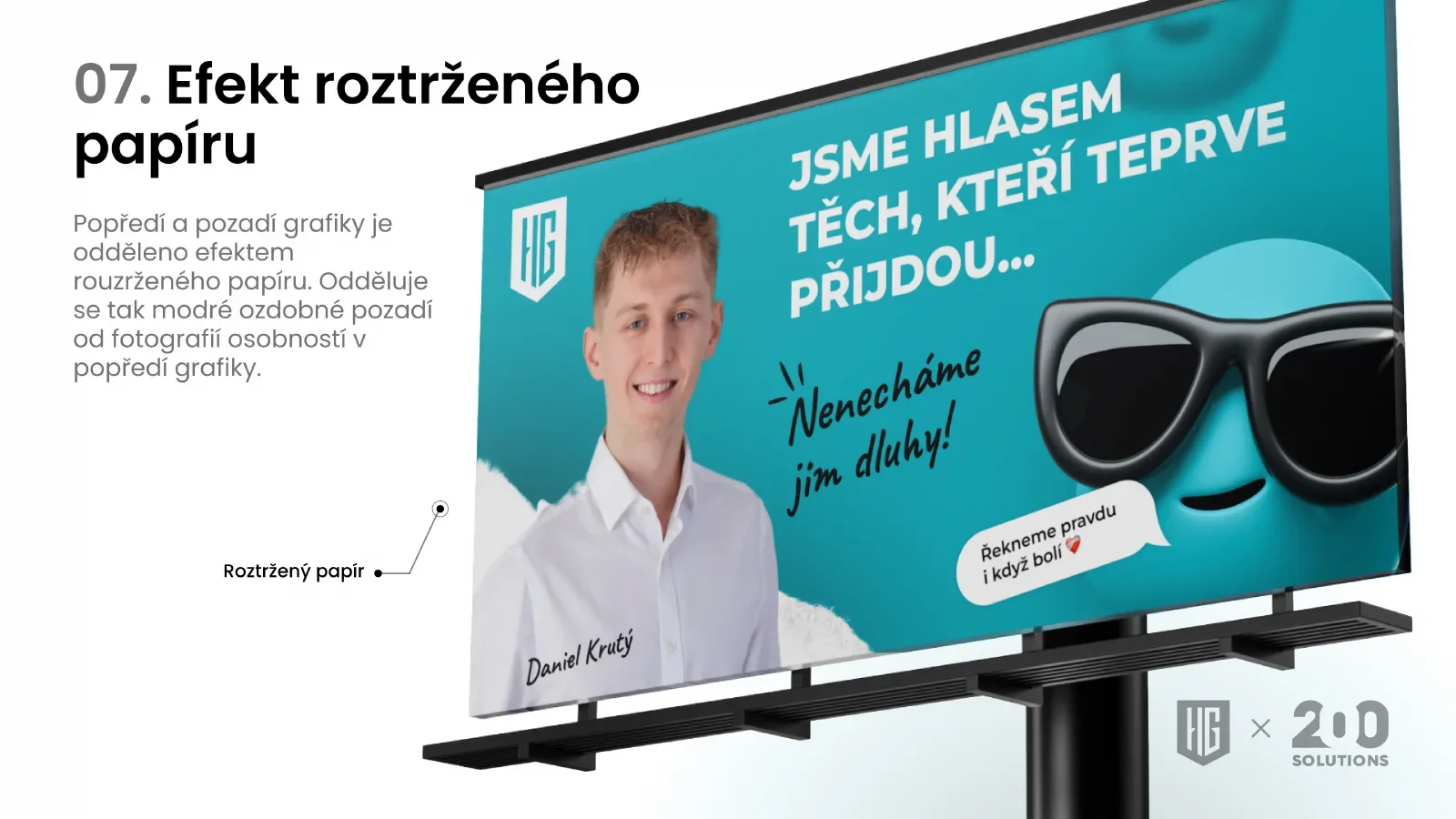
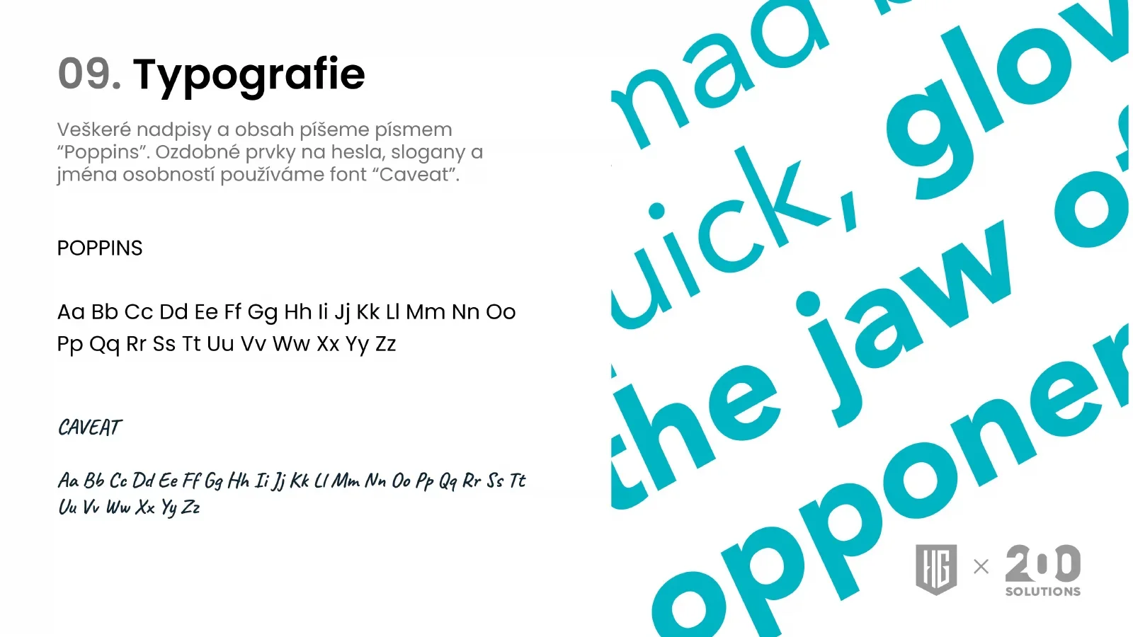
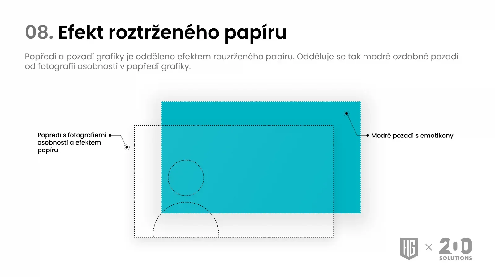
The complete manual of the first collaboration: fifteen pages from the central motif to examples of use.
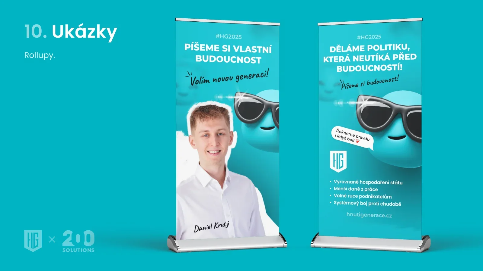
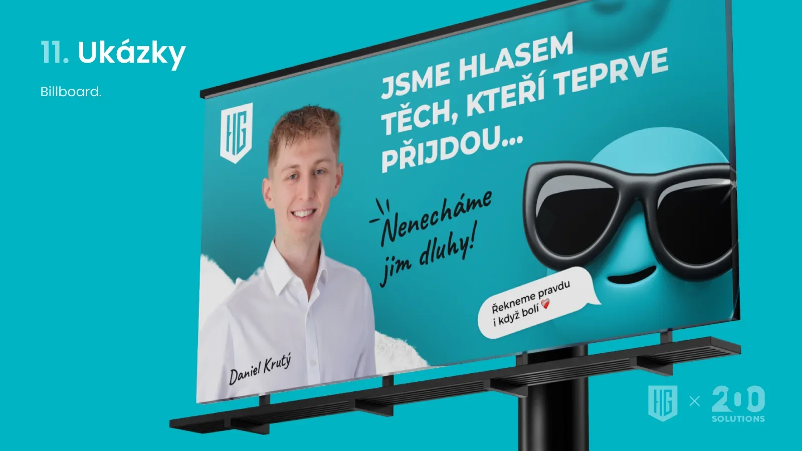
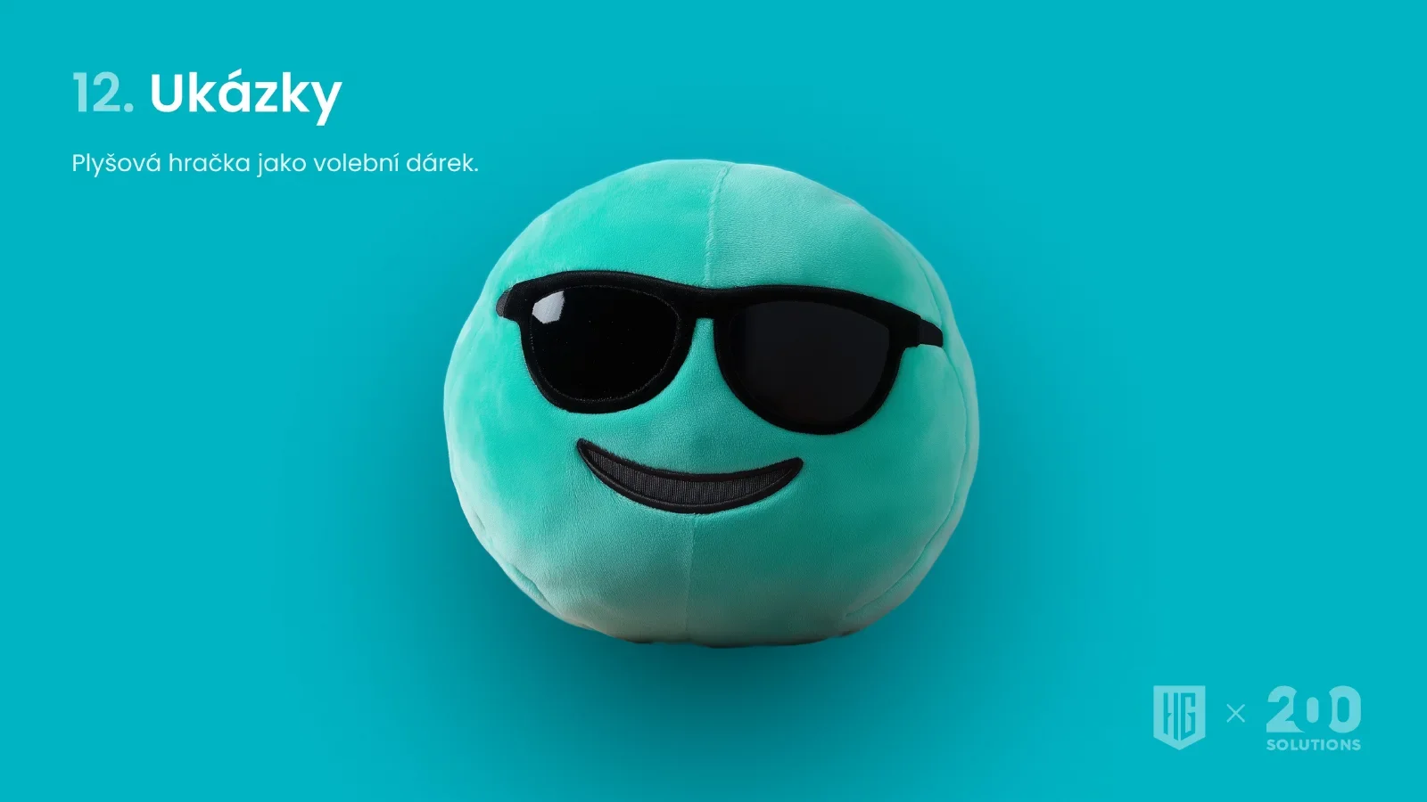
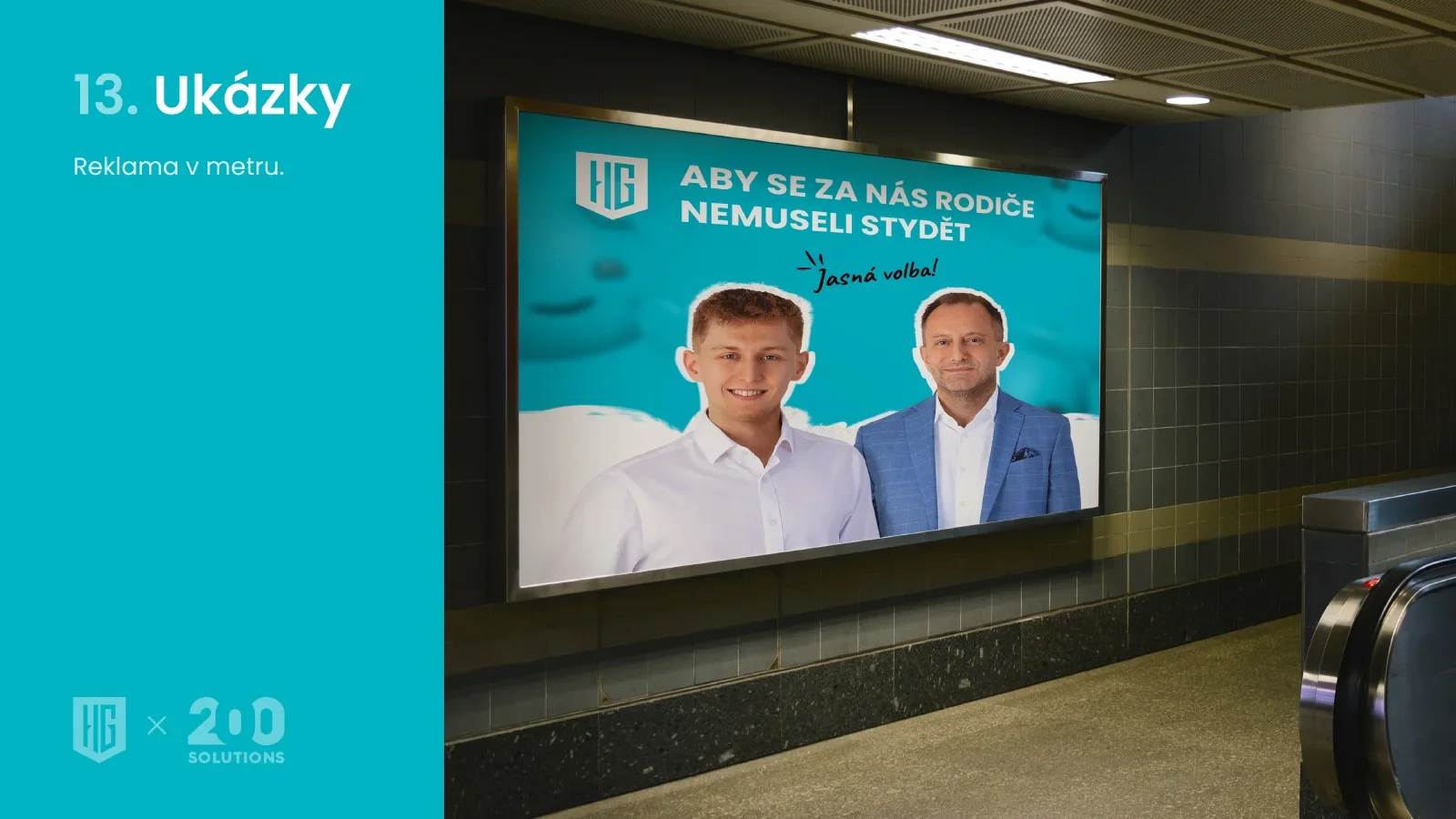
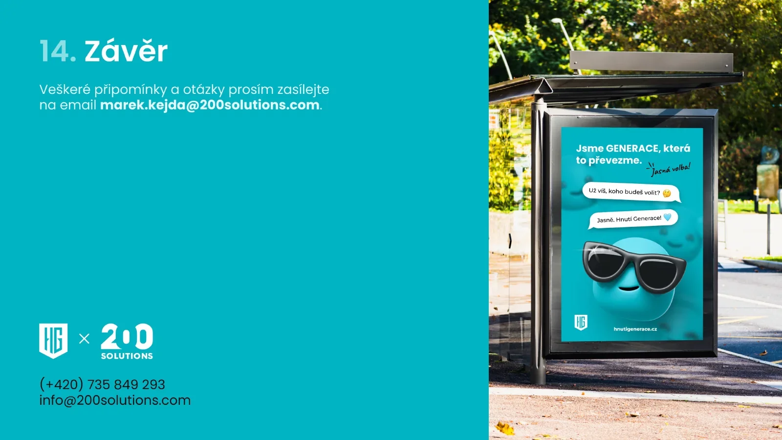
One brand, two distinct directions
We created a website and graphic materials for Hnutí Generace. The work has two separate phases, with different colours, motifs and typography. This study presents them separately so the work from each collaboration is clear.
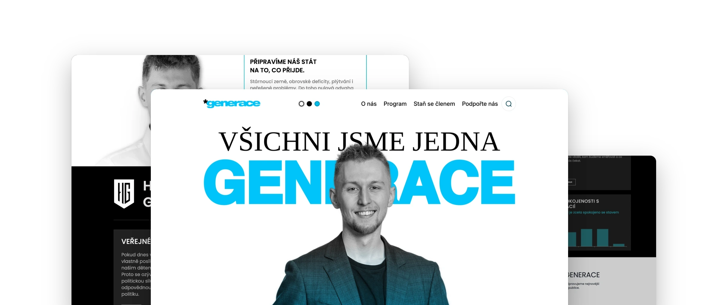
The first direction combines a darker turquoise, emoticons and a distinctive smiley face with glasses. The second uses a brighter turquoise and a different visual language for the website and print. A new website design was also created for this direction; according to the supplied brief, it was not launched.
Consistency connects the work: the website, a large poster and a small business card should each feel part of the same identity.
First collaboration: a website with its own character
Darker turquoise, large typography and emoticons give the first website a recognisable character. Transitions between sections connect the movement, its people and its themes in one continuous presentation.
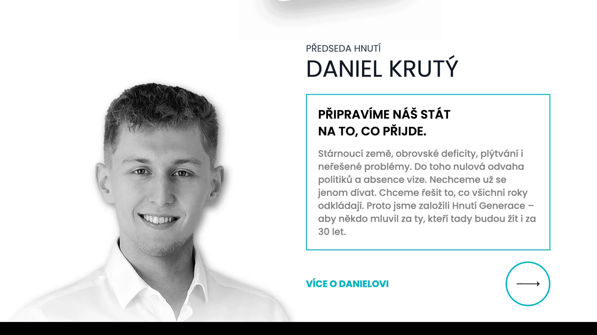
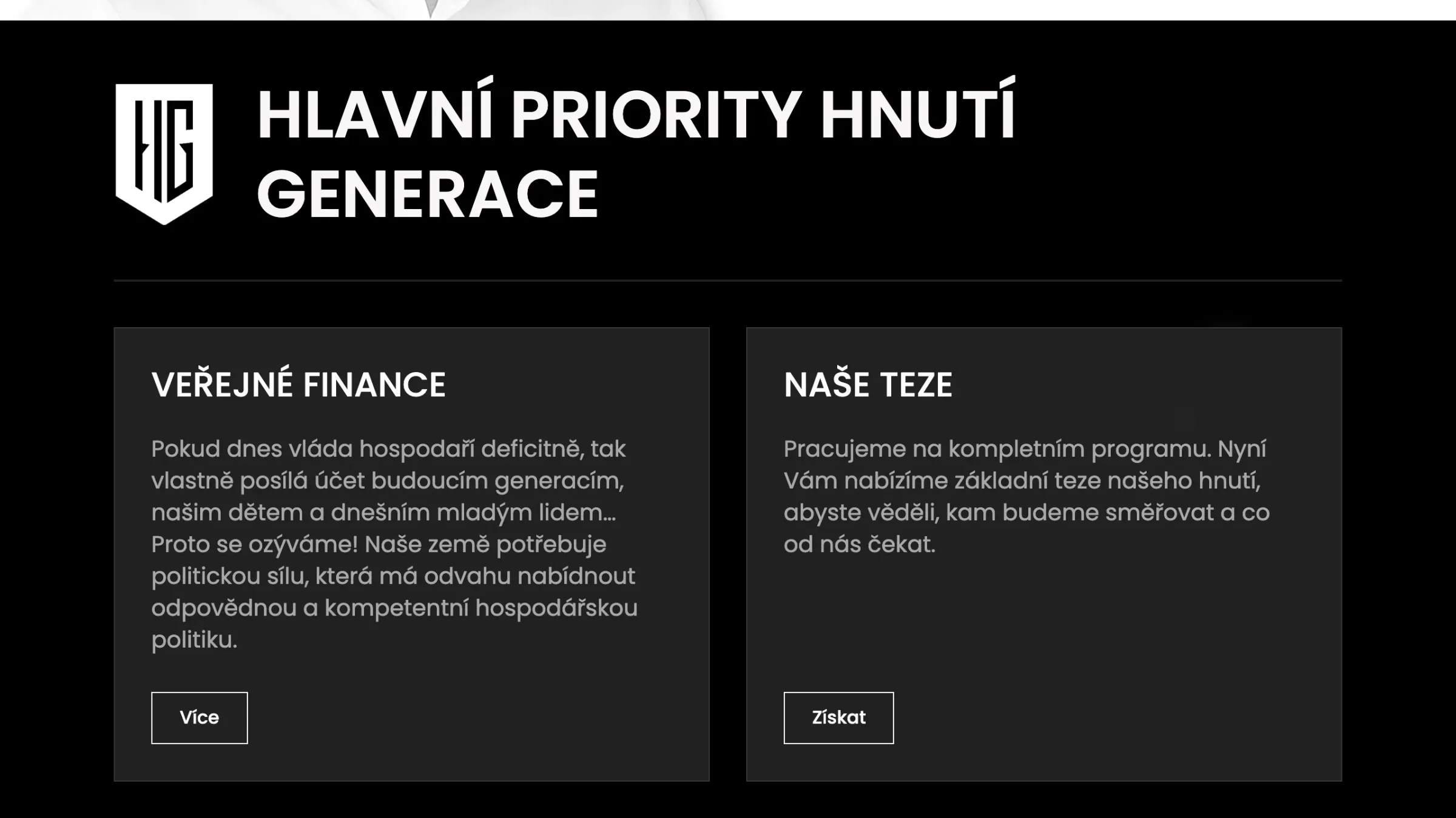
Introducing people and topics
The first identity’s manual
The manual describes the central motif, layers, speech bubbles and typography. It also includes proposals for using the identity beyond the website.
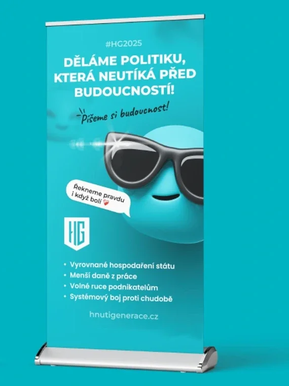
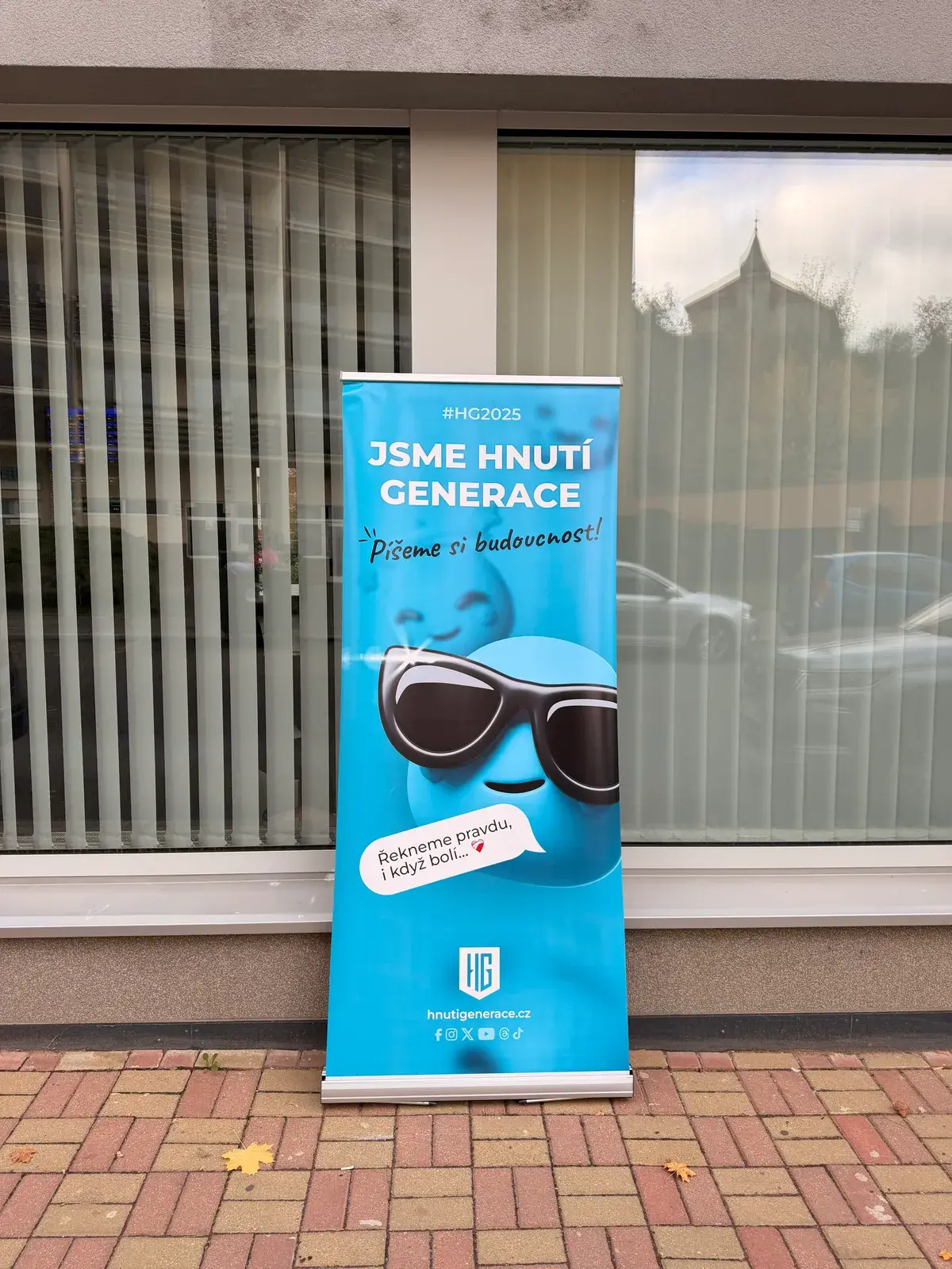
The roll-up from the manual, out on the street
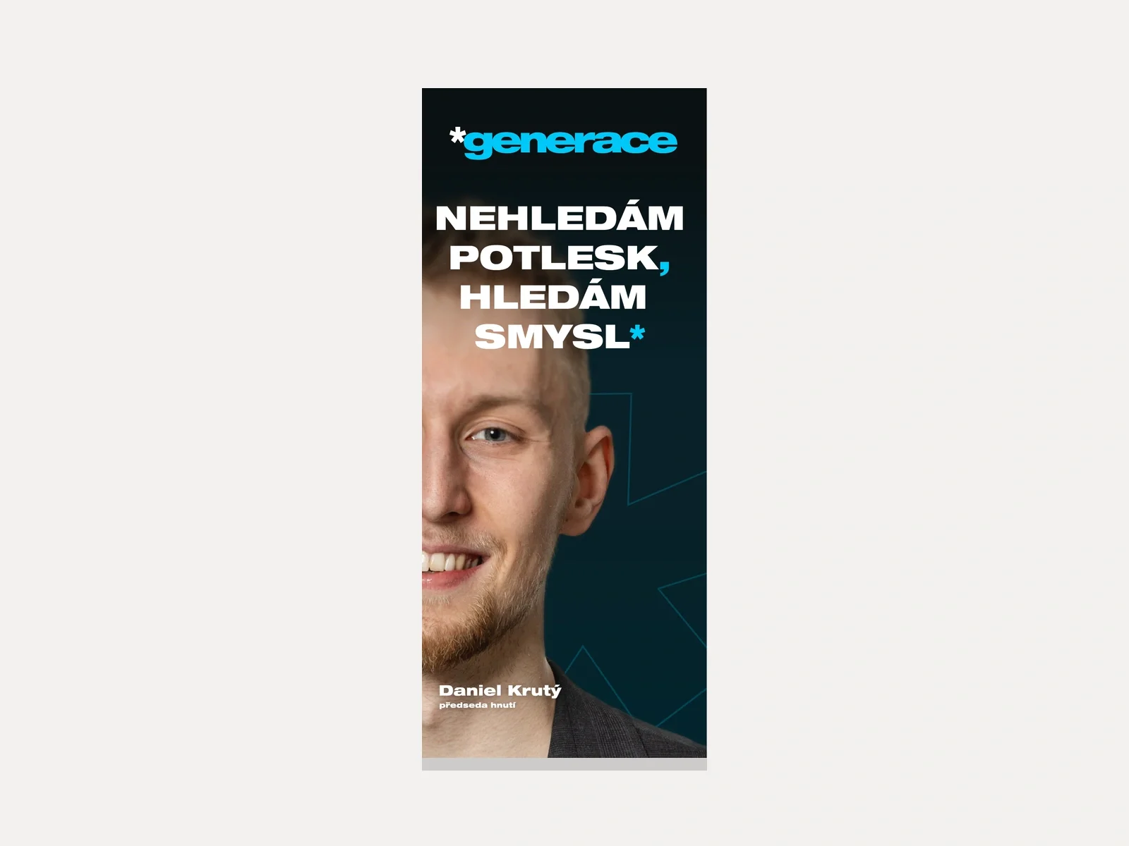
On the left the design from the brand manual, on the right the printed roll-up of the same identity.
Second collaboration: a brighter turquoise
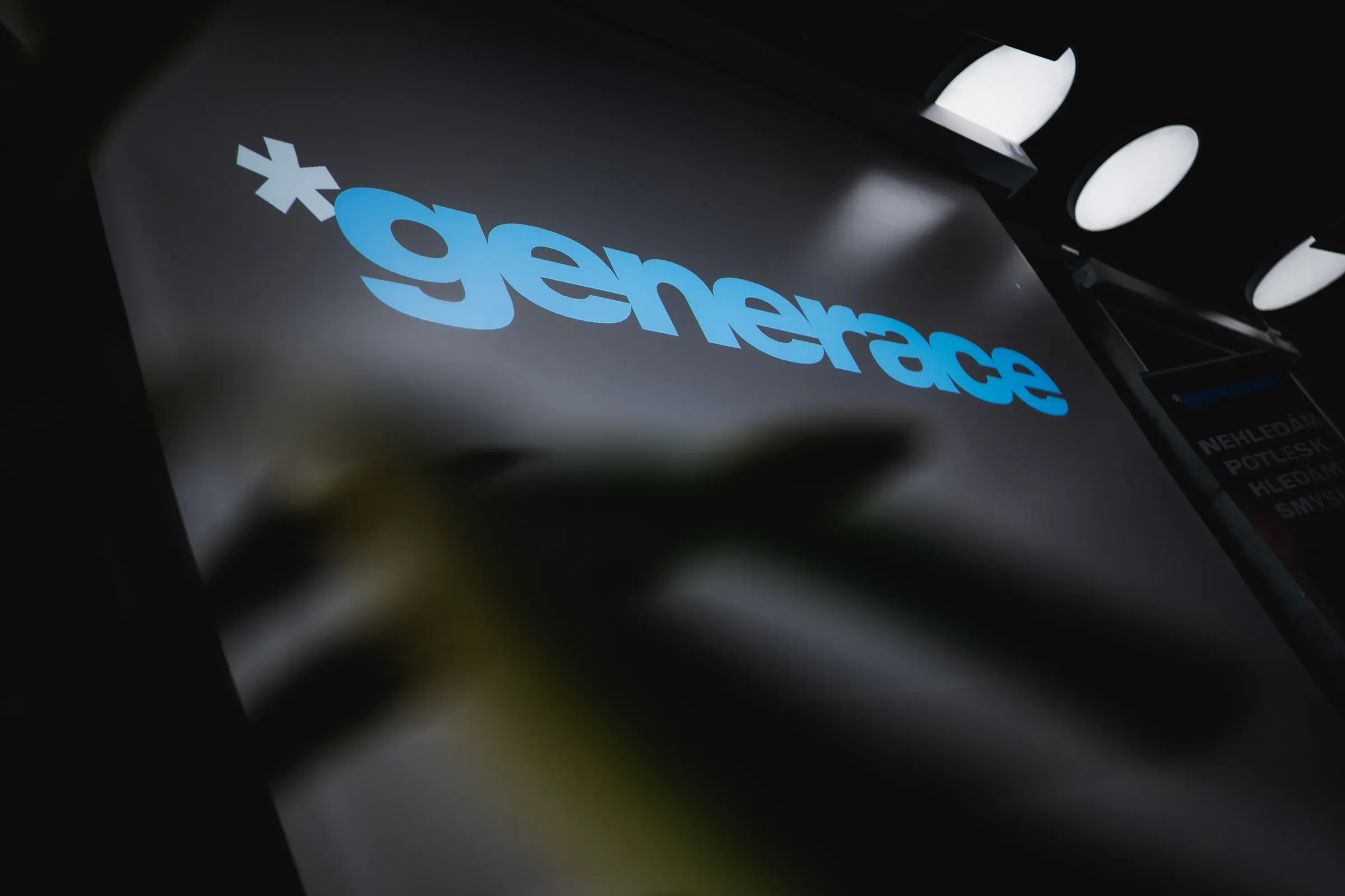
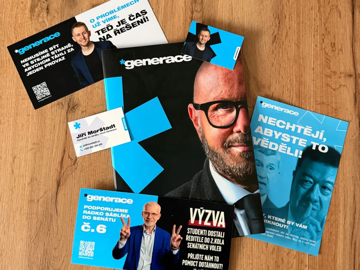
The next phase has a different visual language. A star, sharper typography and a brighter turquoise connect the supplied print materials with the second website direction. These form a separate set of deliverables.
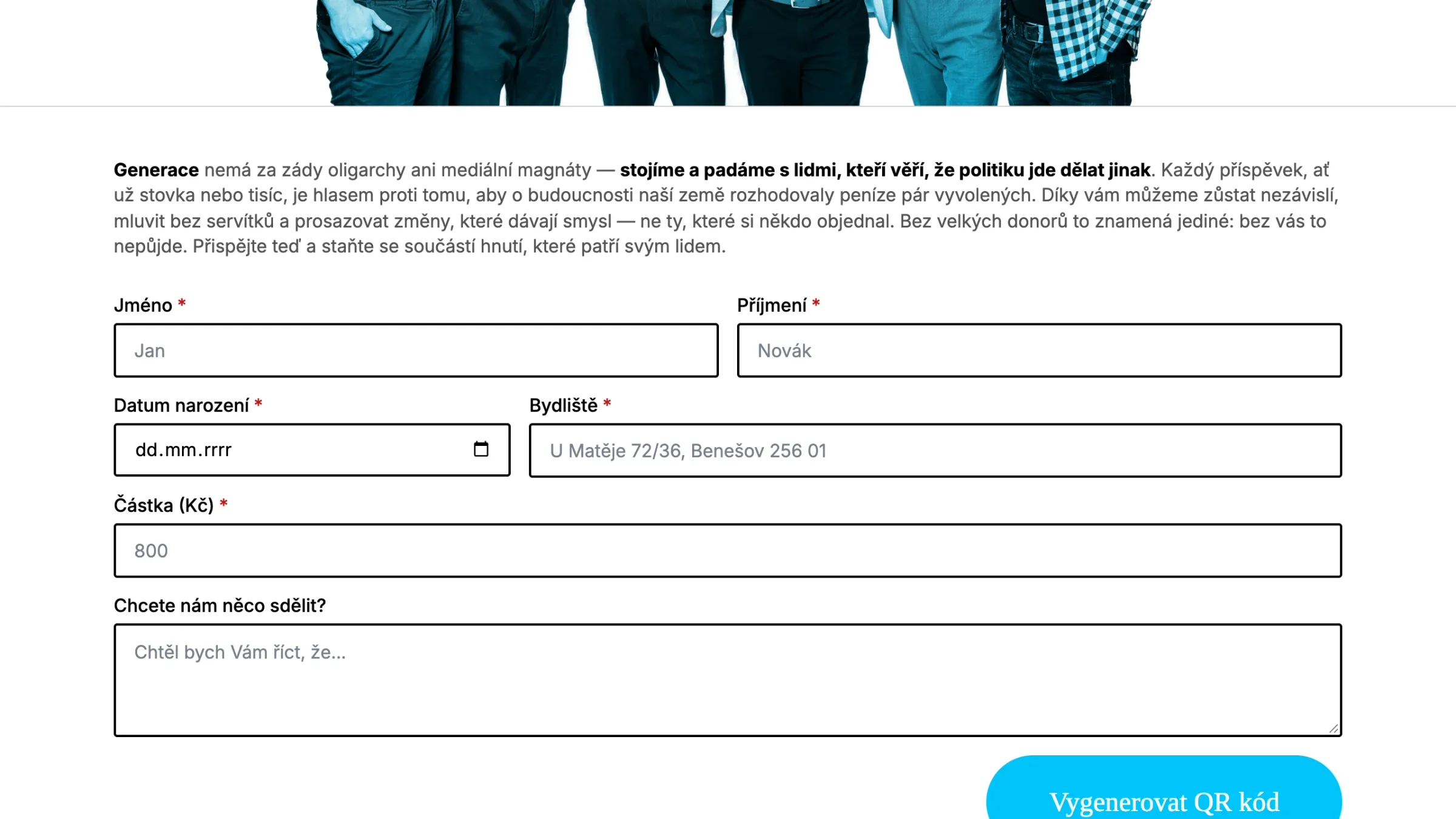
The website example shows a design that was not launched. The support page presents a form and an action for creating a QR code; switching between light, dark and blue themes offers several appearances for the same interface.
The website design from the second phase
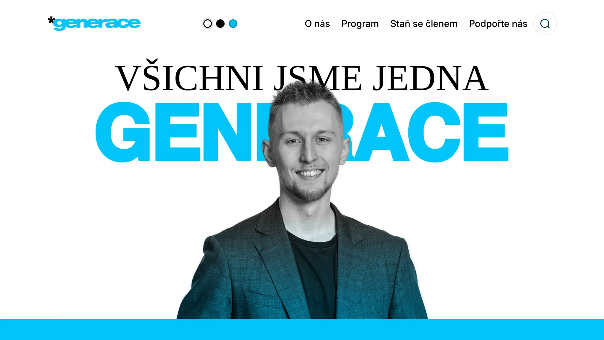
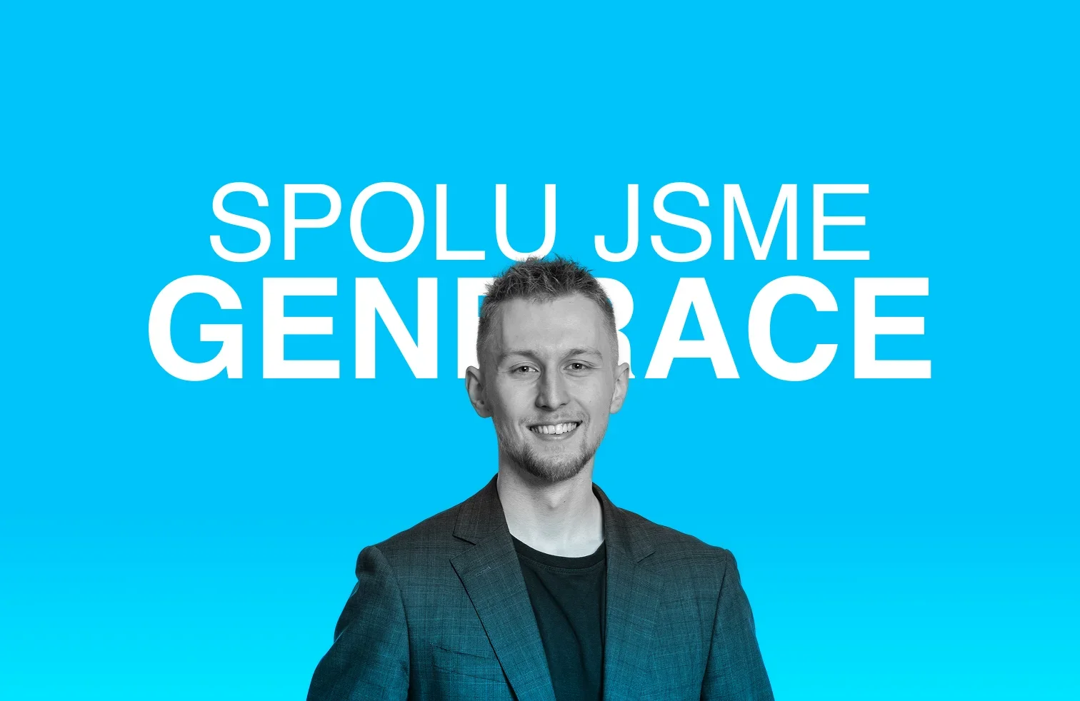
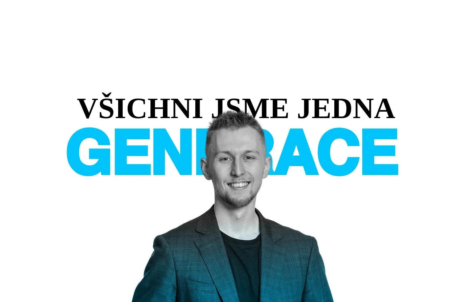
The site’s opening in two variants
The opening section of the second web direction in a blue and a white variant.
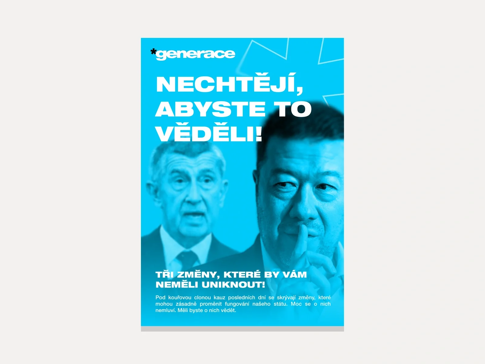
The identity on a poster and in your hand
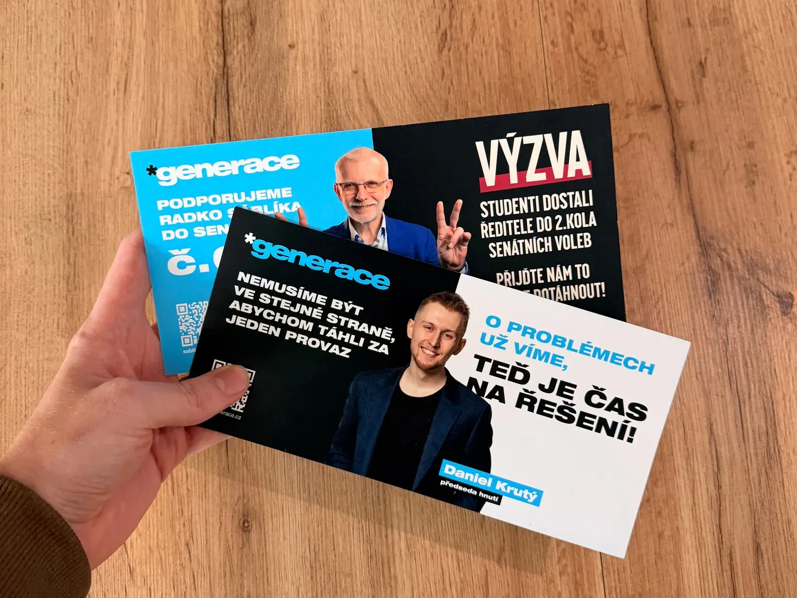
Original supplied materials from the second collaboration. On the left the print files from the editor, on the right the finished print.
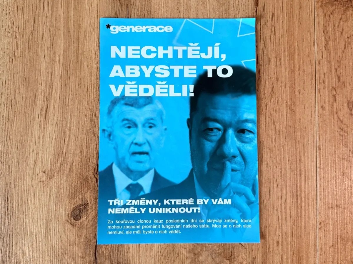
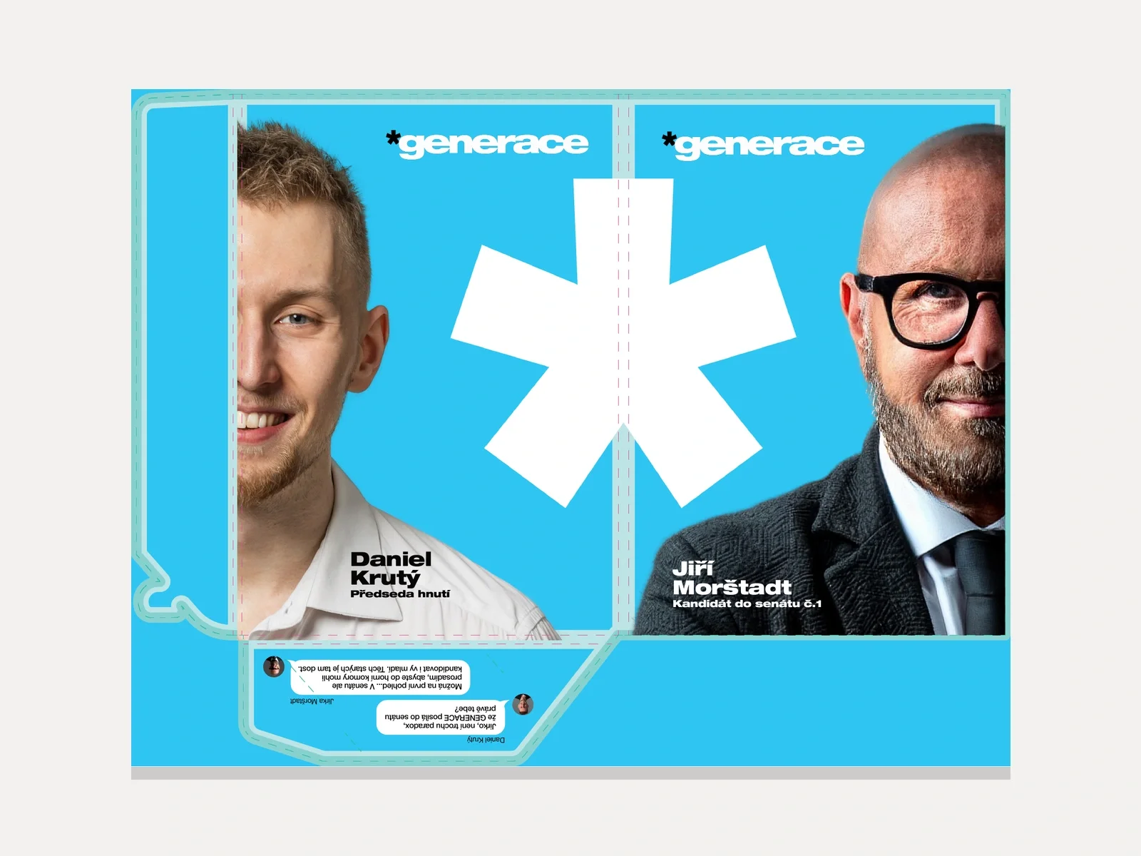
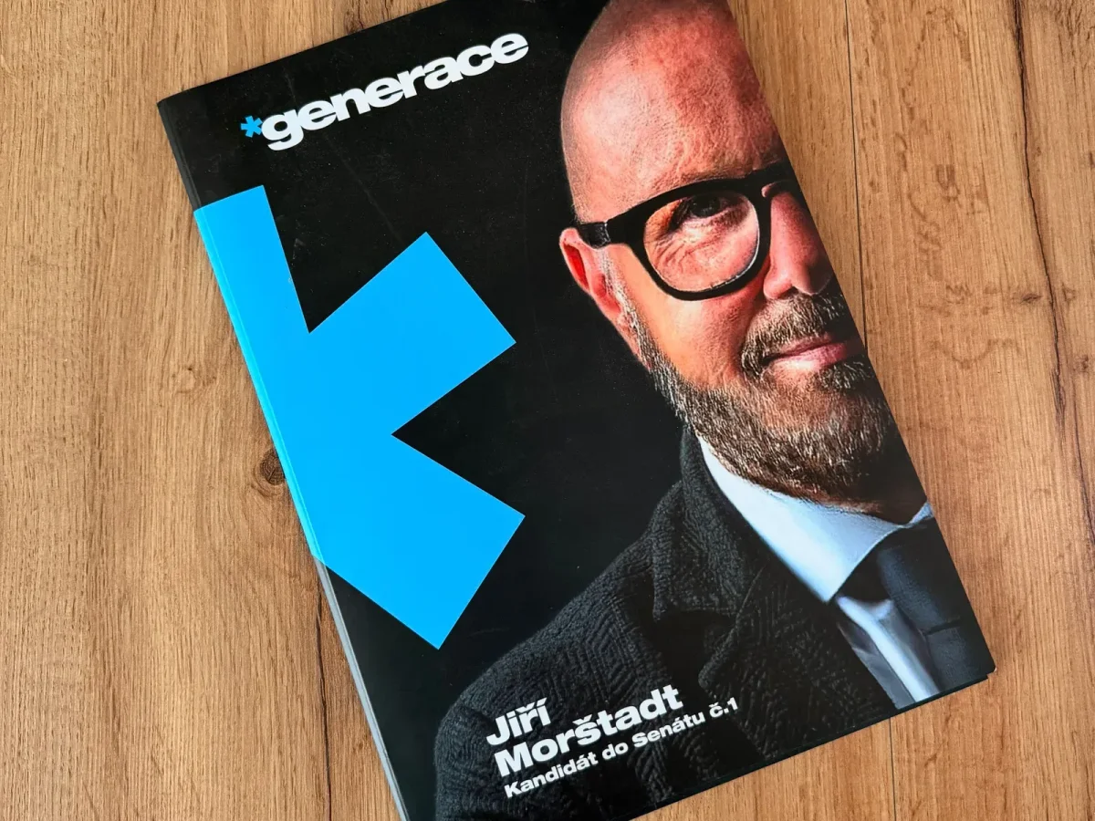
Print for the hand
The business card and the roll-up in the editor, beside them the finished print: the card among the other items and the flyers in a hand.
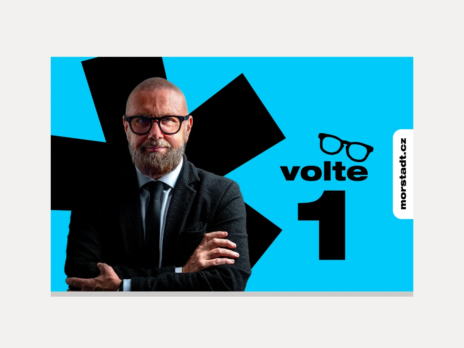
The candidate online and on paper
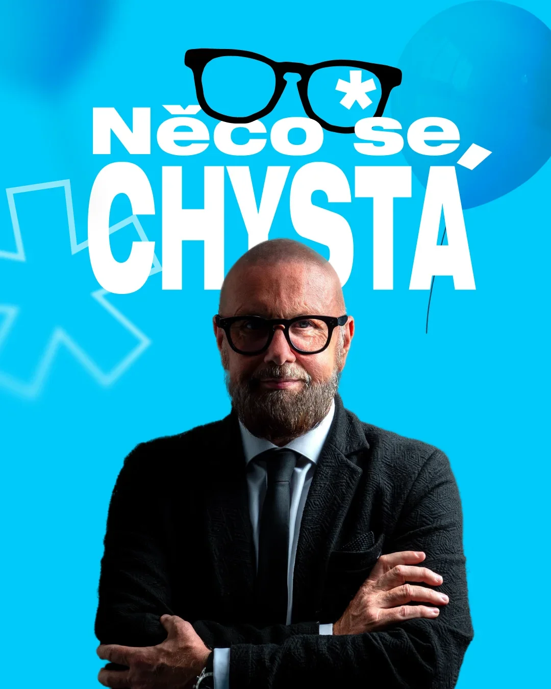
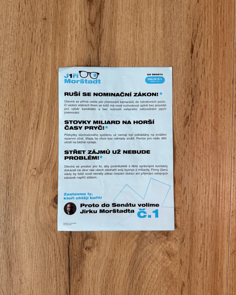
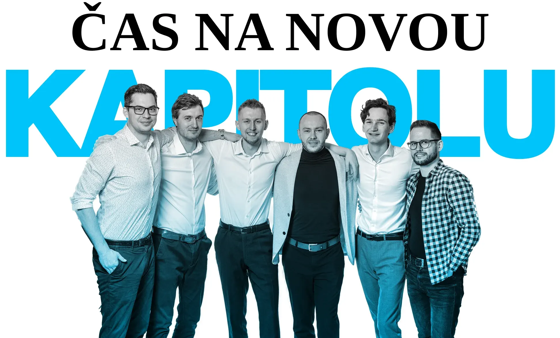
A social media announcement and the leaflet of the Senate candidate Jiří Morštadt in the same visual.
In the client’s words

Working with 200solutions was top class. They did the graphics for Generace and it was always great! You can always come to an agreement with the owner!
Generace live
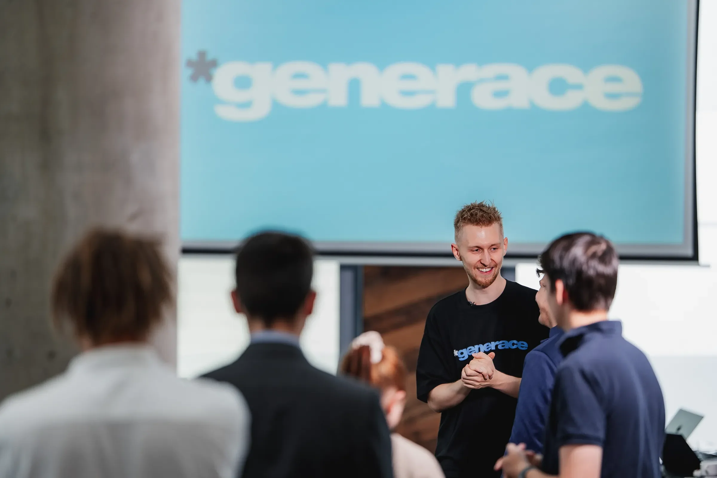
Photos from a movement event: the logo on screen, roll-ups, T-shirts and the people around them.